Oct 1, 2025 | 3 minutes
Navigate faster, work smarter: Make’s redesigned navigation is here
Lisa Kleinman, Head of Product Design at Make, shares how our platform's cleaner, more modern navigation helps you work faster and discover more features.

Every product has a story, and Make’s evolution reminds me of the different ways cities take shape. Some, like New York or Mannheim, are laid out on clear grids – easy to read, efficient to move through. Others, like Prague, where our design team works, grew more organically around rivers, castles, and centuries of history. Its winding streets are full of unexpected turns, while its Metro system runs in clean, predictable lines.
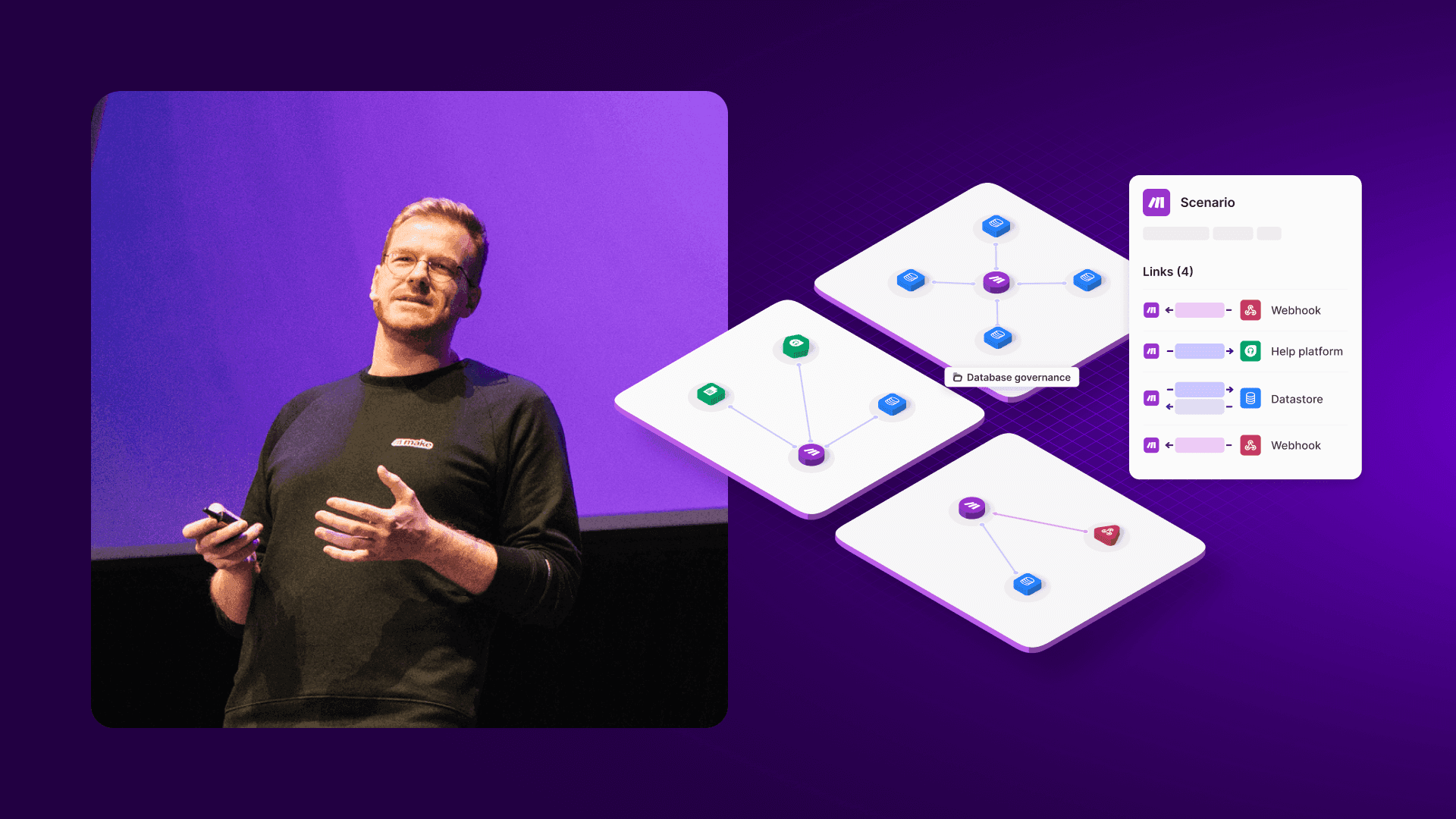
Make has felt a bit like both. Our Scenario Builder, inspired by Prague’s Metro, offers a structured flow where data moves step-by-step through each connection. But in other parts of the product, navigation has developed more like Prague’s streets – part planned, part improvised. Over time, new features appeared like side alleys, making the journey less straightforward. That can be charming in a city, but in a product you rely on daily, it slows you down.
That’s why we’re introducing a new navigation experience for Make. It’s designed to be simpler, cleaner, and more intuitive – helping you find what you need without the detours. Alongside a refreshed visual design, this update not only improves discoverability but also lays the foundation for powerful new features ahead.
The new navigation and design will begin a phased rollout for current customers, with an opt-in period which started last week. If you’re new to Make, you automatically start with the new design.
What’s changing?
We’ve focused on creating a more intuitive and visually refreshed interface. Here are the key updates you'll see.
Goodbye tabs, hello submenu
The familiar tabs at the top of the page have been transformed into a sleek new submenu. Items are now neatly organized into categories, all in one place.
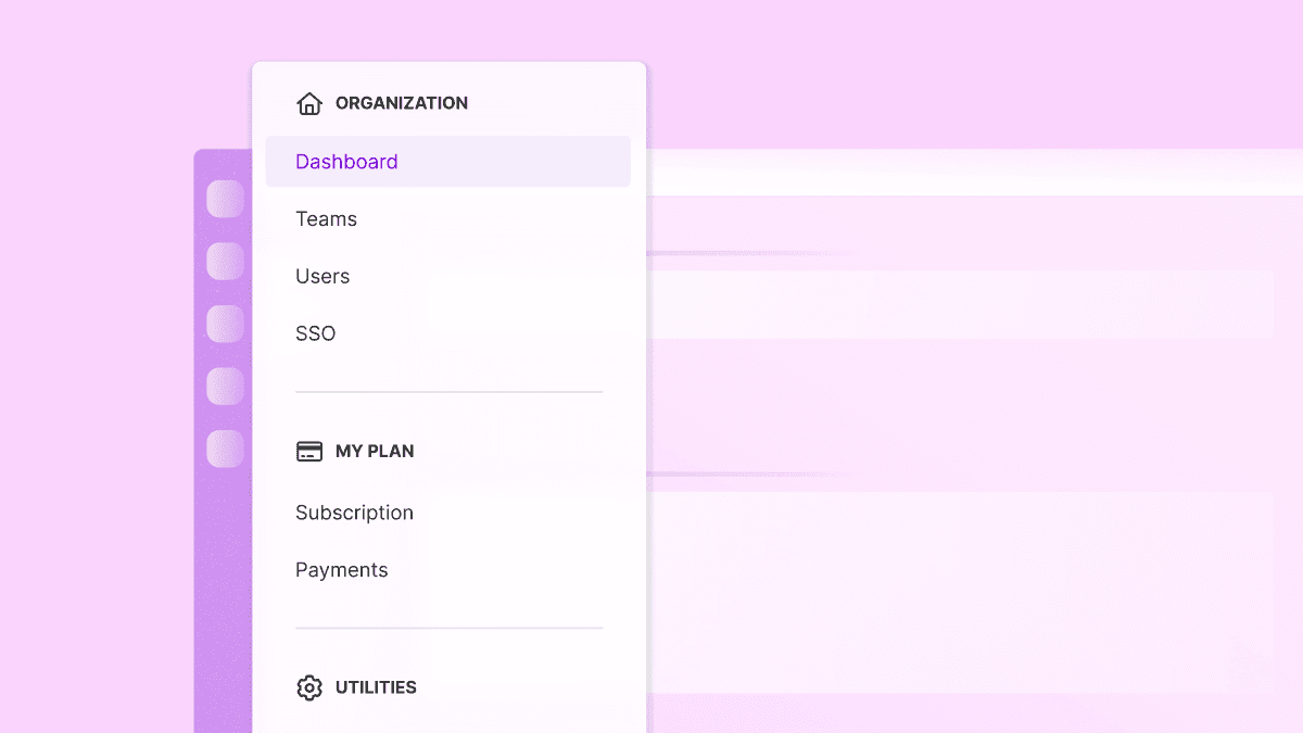
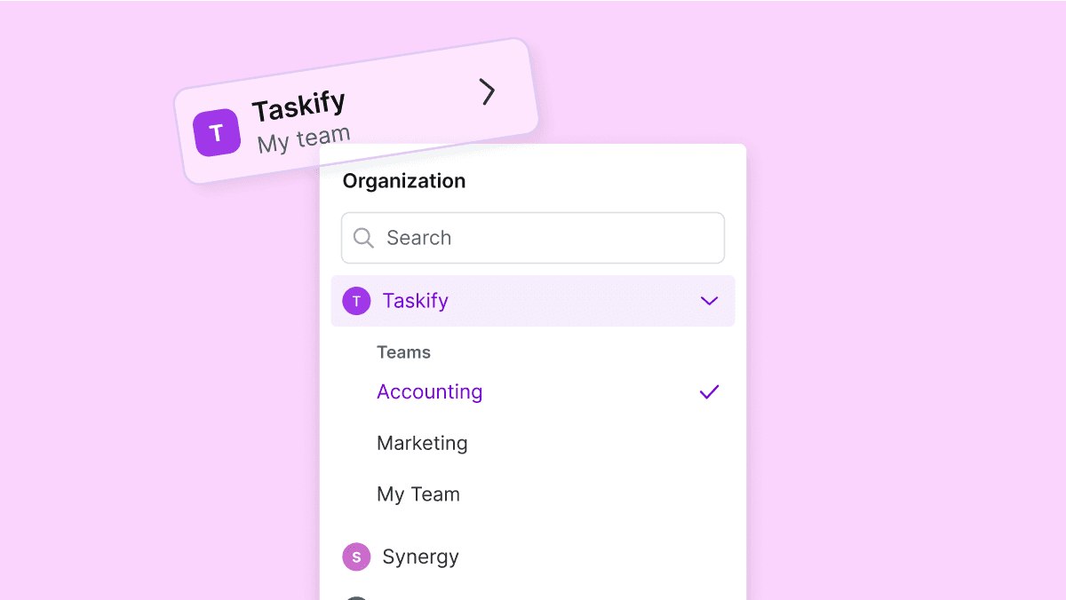
New organization and team picker
We've redesigned how you move between organizations and teams to help you move between your workspaces even faster.
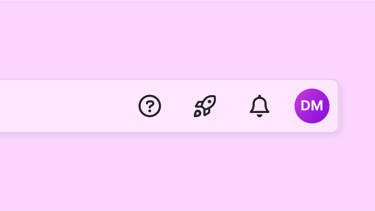
Look up!
Notifications, resources, and your profile just got a shortcut. These items have been moved to the top bar for quicker, easier access.
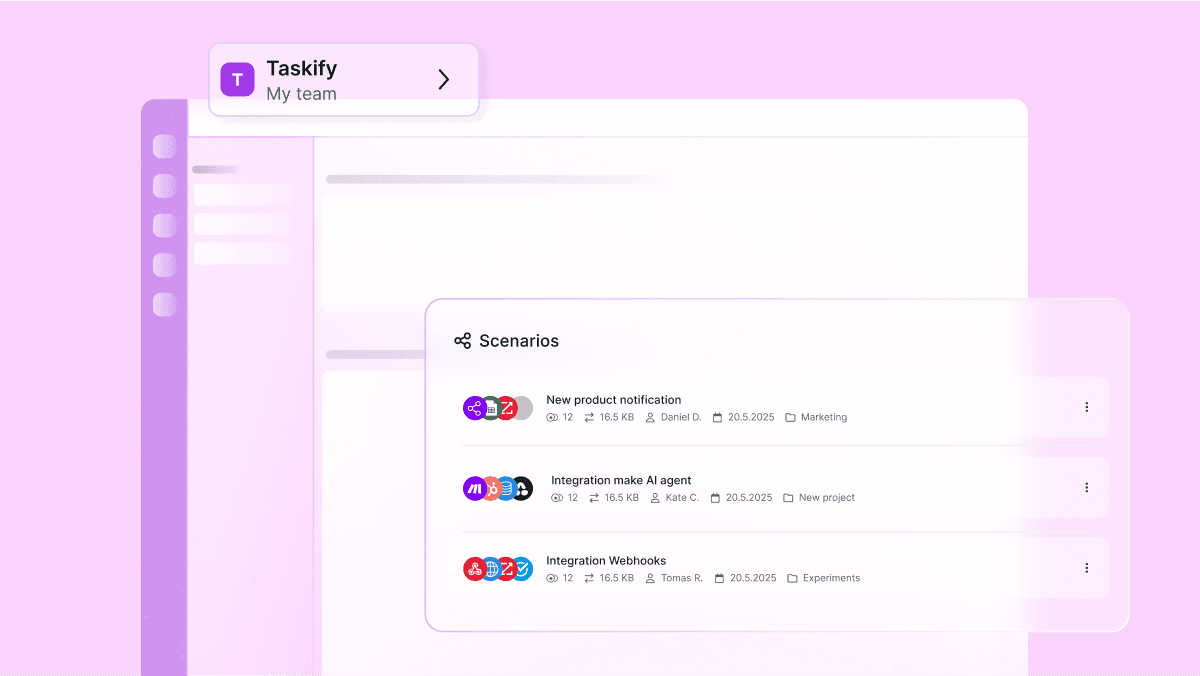
Visual refresh
The interface features an updated purple left menu bar and other visual styling updates, including improved buttons, dropdowns, and lists.
Please note that the navigation for Custom Apps will retain its old tab structure for now. A dedicated redesign for this section is planned for later.
Our phased rollout plan
To ensure a smooth transition, we're rolling out the new navigation in phases.
Current customers opt-in general availability (September 25–October 31)
Current customers will see an in-product pop-up inviting them to "Explore new navigation!". Upon activating, a brief tour will guide you through the key changes. For the following five weeks, you can switch between the new and old navigation anytime from your profile settings menu. Customers who choose to remain on the old navigation will see a banner reminding them that the "New navigation will be enabled on November 1".
New customers (Starting September 25)
All new customers signing up from this date forward will onboard directly with the new navigation experience.
Full general availability (Starting November 1)
On November 1, 2025, the new navigation will become the permanent experience for all users. The old navigation will be deprecated, and any users who have not yet opted in will be automatically switched over and notified with a pop-up.
Shaped by you
This redesign was built with you in mind. By making it opt-in at first, you decide when to explore the changes. We’ll continue gathering your feedback to refine and improve as we go.
Our aim is simple: to give you clearer paths, quicker access to what matters, and a smoother journey across Make platform – so you can get more done with less effort.
Additional resources
Give feedback about Make’s new navigation and visuals
Feature spotlight in our Community
Ready to make the automation revolution happen?